ARCHIVE: W19 Ridgetown and SAS Workshop: Linear Regression

This workshop deals with estimating linear curves using PROC REG and PROC GLIMMIX.  I will be using examples from Bowley, S.R. 2015. A Hitchhiker’s Guide to Statistics in Biology: Generalized Linear Mixed Model Edition. Plants et al. Inc., Guelph, Ontario.

Linear Regression

It’s funny how many people I talk with that remember the following phrase:

Y = mX + b

Our math teachers in high school did a great job with this equation, since most of us remember it.  We also tend to remember what the different parts mean:

m = slope or rise/run
b = Y-intercept or where our line crosses the Y-axis

As soon as we say Y=mX + b, the anxiety that accompanies statistics seems to disappear.  Of course! we can do this!  But, how in the world do we accomplish this in SAS.  No worries, it is fairly straightforward, as long as you remember your goal of Y = mX + b.

We will be using Example 5.3 to demonstrate a Simple Linear Regression.  As statistical procedures mature and new SAS PROCs are developed, it turns out that you can run this analysis in several PROCs.  However, we will concentrate on 2:  PROC REG and PROC GLIMMIX.

Download SAS coding for Example 5.3 here.

PROC REG

Proc reg data=linear_reg;
    model absorb = glucose;
Run;
Quit;

Proc reg data=linear_reg; Calls the PROCedure REG and using the linear_reg dataset

model absorb = glucose;   This is our Y = mX + b – we only have the Y and X in our dataset – absorb = Y and glucose = X.  e want SAS to estimate m and b

Run;
Quit;  <-  We need to add a Quit for PROC REG, it will keep running in the background until we give it more instructions.  So let’s finish it off by adding the quit.  It gives us results (if successful) regardless.

To review the output in PDF form, please download here.

From our output our simple linear regression equation is:

Y = 0.00073*X + 0.0047  or  absorb = 0.00073 * glucose + 0.0047

PROC GLIMMIX

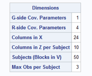
Let’s restart our linear regression estimation by using PROC GLIMMIX and using the problem model to account for our RCBD design.   Remember that in SAS we need 2 statements to run a proper mixed model:  MODEL for our fixed effects and RANDOM for our random effects.  To run this please use the following coding:

Proc glimmix data=linear_reg;
    class block; 
    model absorb = glucose / solution;
    random block / solution;
    covtest “block=0” 0 .;
Run;

Just to restate:  take notice that we have a random effect of Block?  With PROC REG we cannot account for any random effects that may be in our design.  This is one of the benefits of using PROC GLIMMIX, you can do a much better job at modelling your data correctly.

Proc glimmix data=linear_reg; Calls the PROC GLIMMIX and specifies the linear_reg dataset

    class block;    Lets SAS know that we have a classification or grouping variable:  BLOCK

    model absorb = glucose / solution; Here is our Y = mX + b.  In order to obtain the estimates for our slope and our Y-intercept, we need to add the option SOLUTION after our model statement.

    random block / solution;   Our design had a random BLOCK, to better represent our design we are adding the random effect of BLOCK.  By adding the option SOLUTION we will obtain an estimate for the BLOCK effect

    covtest “block=0” 0 .;  Of course, we want to know whether the BLOCK effect is significantly different from 0, so we will add the COVTEST statement here
Run;

To review the SAS output, download here (PDF).

Comparing Regression Response

Now let’s take a look at another example where we may have several treatments being applied at the same time.  Let’s be honest, it is not very often where we will only have one outcome measure with one predictor.  Let’s use Example 6.4 from S.R. Bowley’s text.  The experiment in this example looks at the yield of 3 varieties of alfalfa seeded at 4 different rates: 6, 12, 18, and 24 kg/ha).  We are interested in seeing if there are differences between the varieties and the seeding rates (factorial design of treatments since all the combinations exist).  The trial was conducted in a 3 replicate RCBD experimental design.

The statistical model would be:

Statistical Model

Where:
block = RANDOM effect
variety = FIXED effect
rate = FIXED effect
variety x rate = FIXED effect

Translates directly to SAS as:

model yield = variety | rate;
random block;

Download the SAS code

There are 3 steps to conducting this analysis:

Step 1  Variance Analysis and Means

We want to get an overall picture as to how the variation in our yield outcome measure is partitioned among the parts of our model.

SAS output PDF – Step 1

Step 2  Regression partitions

Why are we doing regression if we want to know if there are variety and rate differences in yield?  Didn’t we just answer that in Step 1?  YES we did, but because one of our factors – RATE – is a quantitative measure – rather than simply saying there are differences at rate x for variety y – let’s go further and look at the trends or regressions across the rates for each variety.  This gives us more information about our treatments.

To do this we are going to take our first model and break it up into different components to run the regression part.  First though we need to create a new variable that takes our rates (6, 12, 18, and 24) and looks at them as quantitative measures and not as categorical measures as we did with in Step 1.  When the variable is listed in the CLASS statement of our analysis, we are telling SAS to treat that variable as a categorical variable – with the groups labelled as 6, 12, 18, and 24.  By doing this SAS treats it as 4 groups – it does not recognize the relationships between them.  So, we create a new variable, let’s call it “x” that contains the same contents as our variable “rate”.  But now we will NOT list it in the CLASS statement, so now SAS sees the variable “x” and it has the values of 6, 12, 18, and 24 – but now it sees the values with 6 units in between each.  We will use this new variable in the creation of our regression equations.

Step 1 model  —————  Step 2 model 

Variety                                  Variety
Rate                                       x  = linear component of Rate
x*x = quadratic component of Rate
x*rate = lack of fit° component of Rate
Variety * Rate                      x*variety = linear component of Rate for each variety
x*x*variety = quadratic component of Rate for each variety
x*rate*variety = lack of fit° component of Rate for each variety

° Lack of fit can be interpreted as all other fits beyond the quadratic.  We can easily describe a linear and a quadratic relationship, but cubic, quartic, etc…  can get complicated – so we use the term “lack of fit” to include all curve fits beyond the quadratic.  Lack of fit to the linear and quadratic.

You will use the results of Step 2 analysis to decide what kind of relationship exists between our levels of Rate: linear, quadratic, or lack of fit.

SAS output PDF – Step 2

Step 3   Regression Coefficients

Now that we know what type of relationship we have between our levels of Rate, now we need to run the analysis for a 3rd time to obtain the regression coefficients.  A couple of notes to consider when running this part of the analysis:

  1. Parms statement – since we already know the model that should be run, with this statement we provide SAS with the estimates of our covariance parameters (random effects) so there are no iterations required to resolve the correct model.
  2. NOINT option in the model statement.  NOINT is telling SAS that we do not want a y-intercept for the entire model.  In other words, we are telling SAS not to force our 3 regression equations to pass through the same intercept.

SAS output PDF – Step 3

Step 4  – can be combined with Step 3 – Regression Comparisons

Now that we have our regression equations, the big question on our minds is:  Are they the same or different?

To answer this question, we need to create a series of ESTIMATE and CONTRAST statement to compare each regression coefficient.

SAS output PDF – Step 4

Don’t forget you can also use these equations to provide you with a visualization of your varieties and rates!

SAS output PDF – Step 5


Name

Ridgetown Workshop: Repeated Measures, Adding Year (Location)

For the purposes of this workshop we will work with some fictitious data.  A trial was conducted with 10 reps (blocks), each rep was made up of 5 plots with 1 treatment applied per plot.  Treatments were randomly assigned to the 5 plots within each Rep (block).   Height of each plot was collected on 3 separate days.

Sample Design used in the analysis

The data used in this workshop can be downloaded here.  Please note that the file includes 2 years of data.  We will add the second year of data for our next analysis.

Repeated Measures Analysis

Here is the coding we will use.  I will break apart each line and explain below.

Proc glimmix data=repeated_measures plots=studentpanel;
    by year;
    class rep trmt day PlotID;
    model yield = trmt day trmt*day / ddfm=kr;
     random rep/ subject=plotID;
    random day / subject=plotID type=arh(1) residual;
Run;

Proc glimmix data=repeated_measures plots=studentpanel;

  • Proc glimmix – calling on the GLIMMIX procedure to run our analysis
  • data=repeated_measures – telling SAS which dataset to use – I happened to call mine repeated_measures
  • plots=studentpanel – this requests all residual plots to be displayed after the analysis

    by year;

  • Since we have 2 years of data – rather than breaking up the data into 2 datasets, we will ask SAS to run the analysis separately for each year – by using a BY statement inside the PROC

  class rep trmt day PlotID;

  • listing out our classification variables – or the variables which tell us what group each of our observations fall into

    model yield = trmt day trmt*day / ddfm=kr;

  • Our model statement
  • We have an RCBD design where we have taken repeated measures on our experimental unit – the plot.  So we are interested in the trmt effect, the day effect and the interaction between then two.
  • ddfm=kr – adjustment to the degrees of freedom which adjusts for bias **see  below for more information on this.

     random rep/ subject=plotID;

  • Remember we have an RCBD which means we need to let SAS know that our REPs (or BLOCKs) are a random effect in our model.  Since each of our treatments only appears once in each block – there will be NO trmt*rep interaction
  • This random statement tells SAS that our rep is random – we add a subject= part to the random statement to reaffirm to SAS what our experimental unit is – in this case, PlotID

    random day / subject=plotID type=arh(1) residual;

  • The second random statement in this PROC – is to specify the repeated aspect of our design.
  • Day is the variable which tells us where or when the measures were repeated.
  • Subject tells SAS what the experimental unit was – PlotID in this case
  • We also need to tell SAS what type of relationship there is between the measures taken on the experimental units is – type=arh(1).  Also known as the covariance structure.  In this example I have tried a number of them – which you should always do, and select the one which results in the model with the lowest AICC statistic.  In this example arh(1) – heterogenous autoregressive was the best fit
  • residual – tells SAS that you are partitioning the R-side of the error (experimental error) into a portion due to the repeated measures taken within an experimental unit.

The output for this analysis can be downloaded here.  Start from the bottom of the output file for 1 year to review the residuals.  Please note that there are NO normality statistics produced only the plots.  To run the normality statistics you will still need to save the residuals in a new dataset and rung the PROC UNIVARIATE normal with the residuals.  However, reviewing these plots gives you a great starting point.

Once you are “happy” with the residuals, start reviewing the output from the beginning of the PROC GLIMMIX.  Carefully review the Dimensions table:

Dimensions table from the SAS PROC GLIMMIX output

  • G-side Cov. Parameters = 1 – this refers to the random effect of Rep (Block).  Remember G-side is the random variation between our experimental units.
  • R-side Cov. Parameters = 4 – this refers to the random effects within our experimental units – 3 days + residual error
  • Columns in X – how many levels do we have for our fixed effects in our model?  Trmt = 5, Day = 3, Trmt*day = 15, 1 for the overall mean = 24
  • Columns in Z per Subject – our Rep is our random effect and we have 10 reps
  • Subjects (Blocks in V) = 50 – 10 Reps with 5 plots/rep = 50 experimental units
  • Max Obs per Subject = 3 – each experimental unit (plot) was measured 3 times

You should always be able to track back all these pieces of information to your model.  If you are analyzing a repeated measures it is important to ensure that the last 2 lines of this table is correct.  If they are not, then your model is not reflecting a repeated measures analysis of your trial.

Review the second year of this output to ensure it was run correctly as well.

Doubly Repeated Measures – PROC MIXED

So now let’s add in that second year.  We have a trial which was conducted 2 years in a row.  The previous analysis conducted a repeated measures on the data collected each year as a separate analysis and really as a separate trial.  But, we know there is some relationship between the 2 years, since the same location was used and the same treatments, the same experimental units – so there must be a relationship and we must account for it somehow.

There are 2 ways to handle this at the moment in SAS.  The first way we will look at is treated it as a truly doubly repeated measures – if you think about it – we have the days repeated and we have the years repeated.  Now GLIMMIX cannot necessarily handle this IF there are 2 covariance structures that need to be used – One for Year and one for day, but MIXED can – by using a Kronecker product covariance structure.

Proc mixed data=repeated_measures covtest;
    class rep trmt day PlotID year; 
    model height = trmt day trmt*day Year year*trmt year*day year*trmt*day/       ddfm=kr;
    random rep / subject=plotID;
    repeated year day / subject=plotID type=un@cs;
    lsmeans year*day;
    ods output lsmeans=lsm;
Run;

Proc mixed data=repeated_measures covtest;
    class rep trmt day PlotID year; 

  • These are the same as our PROC GLIMMIX above with the addition of our Year effect in the CLASS statement

model height = trmt day trmt*day Year year*trmt year*day year*trmt*day/       ddfm=kr;

  • Our model has now been expanded to include the effect of the Year.  We are interested in the main effect of Year, the interaction between year and trmt, the interaction between year and day, and the three-way interaction of year, trmt, and day.  If you think these through you will see that we are indeed interested in the if and how the different years have affected the trmt and the day repeated aspect of our trial.
  • Note that we are treating YEAR as a fixed effect.

  random rep / subject=plotID;

  • same as our GLIMMIX statements above

  repeated year day / subject=plotID type=un@cs;

  • MIXED has a specific REPEATED statement whereas GLIMMIX no longer has this.  Note that the structure of this statement is almost identical to the RANDOM statement we used in GLIMMIX with two changes:
    • There is no need to say RESIDUAL with the REPEATED statement in MIXED
    • We are telling MIXED that we have 2 covariance structures with the type= statement
    • un@cs – tells SAS that we want it to use an UNstructure covariance structure for the 2 years, and a CS(compound symmetry) structure for the 3 day measurements.

  lsmeans year*day;
    ods output lsmeans=lsm;

  • These statements are built the same in MIXED and GLIMMIX – I added them here so we can review the lsmeans

To review the complete output provided by this code, please download and view the PDF file.

Doubly Repeated Measures – PROC GLIMMIX

So as I mentioned earlier GLIMMIX cannot handle the true doubly repeated aspect of some of our experiments – what it cannot do is recognize and implement the 2 difference covariance structures for the 2 repeated effects.  However, what we can do is add YEAR as a random effect into a GLIMMIX and our fixed effect results are similar.

Proc glimmix data=repeated_measures plots=studentpanel nobound;
    class year rep trmt day PlotID;
    model height = trmt day trmt*day Year year*trmt year*day year*trmt*day/ ddfm=kr;
    random rep/ subject=plotID group=year;
    random day / subject=plotID type=cs residual;
    lsmestimate year*trmt “2016 Treatments AandB vs C” -1 -1 2 0 0 0 0 0 0 0 ;
    lsmestimate year*trmt “2016 vs 2017 Treatment A” -1 0 0 0 0 1 0 0 0 0 ;
Run;

Proc glimmix data=repeated_measures plots=studentpanel nobound;
    class year rep trmt day PlotID;
    model height = trmt day trmt*day Year year*trmt year*day year*trmt*day/ ddfm=kr;

  • These statements are the same as the previous GLIMMIX and/or MIXED.  Only difference is that I added the nobound option to allow our random effects to have negative variance.  Everything else is the same!

    random rep/ subject=plotID group=year;

  • This statement tells SAS that our REP is random – we have seen this above in both the GLIMMIX and MIXED coding.
  • But this time we have added a GROUP=option.  This allows us to group the random REP effect within each year.  Essentially adding a rep(year) effect to our model.

    random day / subject=plotID type=cs residual;

  • This is our repeated statement for day – which we have seen already.

    lsmestimate year*trmt “2016 Treatments AandB vs C” -1 -1 2 0 0 0 0 0 0 0 ;
    lsmestimate year*trmt “2016 vs 2017 Treatment A” -1 0 0 0 0 1 0 0 0 0 ;

  • Another new statement that you should be aware of.  The LSMESTIMATE allows us to essentially run contrasts amongst our LSMeans – something we were unable to do with MIXED.
  • Something to consider for future analyses and research questions

To review the complete output provided by this code, please download and view the PDF file.

GLIMMIX – Random rep/ group=year VS Random rep(year)

I mentioned above that the statement  random rep/ subject=plotID group=year;  was similar to adding the rep(year) effect as a random effect.  To show you the differences between the output try running the following code:

Proc glimmix data=repeated_measures plots=studentpanel nobound;
    class year rep trmt day PlotID;
    model height = trmt day trmt*day Year year*trmt year*day year*trmt*day/ ddfm=kr;
    random rep(year)/ subject=plotID ;
    random day / subject=plotID type=cs residual;
    lsmestimate year*trmt “2016 Treatments AandB vs C” -1 -1 2 0 0 0 0 0 0 0 ;
    lsmestimate year*trmt “2016 vs 2017 Treatment A” -1 0 0 0 0 1 0 0 0 0 ;
Run;

random rep(year)/ subject=plotID ;

  • This is the only line that is different.  Similar to above – we are adding the random effect of rep(year), and reminding SAS that our experimental unit is plotID but specifying this as the subject

Differences in the output of the 2 previous analyses:

  1. random rep/subject=plotID group= year;  provides 2 G-side covariance parameters – one for each year.  Whereas the random rep(year) / subject=plotID; only provides one parameter the rep(year) effect
  2. AICC for the group=year model = 1638.32, whereas the AICC for the rep(year) model =1656.04.  Suggesting that we are doing a better job with the group=year model.
  3. Since we have different number of covariance parameters, we will have different estimates:cov_GLIMMIX
  4. Overall the Type III Fixed effects for the 2 models were identical

DDFM=KR

We see this added to many of our models and let’s be honest, we ask ourselves WHY?  Is this something I should be adding or not?  When should I be using this?

A quick review

Mixed methods were developed in the 1980-1990s and there has been a lot of research surrounding these methods.  Especially surrounding the are of small sample sizes – now this is a relative term and I will not provide any thoughts as to what is referred to by small sample sizes.

Research has found that when estimated variance and covariance parameters are used to calculate statistics, such as the F-statistic, the results are often biased upward, while the standard error estimates used to calculate confidence intervals are often biased in the opposite direction or downwards.  What does this mean?  We have a higher F-statistic – greater chance of seeing differences, and a small confidence interval.  Now these trends tend to happen when we use mixed methods – which most of us are today.

Research has shown the following trends:

  • There is NO problem when we have balanced designs with a FIXED effects model
  • There is a slight problem with we have unbalanced designs with a FIXED effects model
  • A BIG problem when we have more complex models

So, we can play it safe and use the DDFM adjustment for all of our models.  Let’s be honest, we may have small sample sizes, and we may never be sure whether our model is one that is considered complex or not.

It has been recommended that adding the DDFM=KR should be something that becomes second nature to us and should be added to all of our MODEL statements in GLIMMIX.

Name

Split-split-plot and more experimental designs

Split plot and strip plot (or split block) designs are commonly used in the agronomy, however, they don’t stop there.  We quite often have limited resources and may add on a factor or two on top of our current trial.  This blog post and session will expand on the Split-plot and the Strip-plot (split-block) designs.

Split-split-plot

We have 3 experimental units with 3 differing sizes.  The whole plot, the sub-plot, and the sub-sub-plot.  This link contains a PDF document that displays the Split-split plot design and also contains the Statistical model.

Factor A is the Whole plot – with two levels: A1 and A2.  A1 and A2 are randomly assigned within a block (or rep).  In this illustration we have 2 Blocks (Reps).Main plot of a Split split plot design

The WHOLE plot is now divided into SUB Plots.  Factor B, which has 3 levels is randomly assigned to each level of Factor A in the WHOLE plots.Sub plot of a Split split plot design

The SUB plot is now divided into SUB-SUB Plots.  Factor C, which has 5 levels is randomly assigned to each level of Factor B in the SUB plots.Sub Sub plot of a Split split plot design

Let’s build the model for the Split-Split plot design as modeled above:

Statistical model for a SPlit SPlit plot design

Definition of the Statistical model for the Split split plot design

Split-split-split plot

An extension of the split-split-plot, with a 4th experimental unit.  Same as above 4 differing experimental unit sizes, and therefore 4 errors to be aware of.

Split-plot x Split-block (strip-plot)

The combinations do not seem to end.  The more we look into these designs, the more I realize that many trials that we currently conduct may not be what we think they are.

In this case we are looking at the Split-block or Strip-plot design and within each row/column combination we are adding a third factor within this experimental unit and will aim to randomly assign them – leading us to a Split-plot x split-block design.

I will update with a picture of a design and the statistical model that accompanies it.


Conclusion

After working through these three examples, which design do you think you truly have?

I propose for the last workshop session in April, that we review Latin Square designs, and the combination of Split-plot and latin squares, as I suspect this will talk to a few researchers 🙂

Name

Experimental Designs

What is an experimental design?

Is the process of planning a study to meet specified objectives.  An experiment that SHOULD be designed to match a specific research question.

Steps to designing an experiment

  1. Define the EXPERIMENTAL UNIT
    What is the difference between an EXPERIMENTAL UNIT and a SAMPLING UNIT?
  2. Identify the types of variables
  3. Define the treatment structure
  4. Design the design structure

Experimental Unit  vs. Sampling Unit

Experimental unit is the unit to which the treatment is applied to.

Sampling unit is a fraction of the experimental unit.

Examples of potential experimental units:

  • An animal
  • A cage with 5 birds inside
  • A plot in a field
  • A box of fruit
  • A tree
  • A pot of plants
  • A growth chamber
  • A fish tank
  • A tray of seedlings
  • A taste panelist
  • A sample of a new food product
  • A bench in a greenhouse

Examples of potential sampling units:

  • 1 bird in a cage
  • A quadrant in a plot of a field
  • 5 apples from a box
  • A branch or leaf of a tree
  • 1 plant from a pot of plants
  • A tray or shelf placed in a growth chamber
  • An individual fish from a fish tank
  • One pod of seedlings from a tray
  • A plot on a bench in a greenhouse

Experimental Error

Measure of the variation that exists among observations taken on the experimental units that are treated alike.

Sources of Experimental Error

  1. Natural variation among experimental units
  2. Variability of the measurements taken (response)
  3. Inability to reproduce the treatment conditions exactly from one unit to another
  4. Interaction between the treatments and the experimental units
  5. Any other extraneous factors that may influence the response

With any statistical analyses, what we are looking for is an estimate of the variation of the experimental error.  So, the variation between our experimental units – We need this  to test treatment differences.

Variation of observations within an experimental unit will not give us treatment differences!

Completely Randomized Design (CRD)

Treatments that are randomly assigned to experimental units.

Completely Randomized Design

Experimental unit is the individual plot/square in the design.  The statistical model is represented by:

Model for the CRD

Where:

Yij = Observation on the jth experimental unit on the ith treatment
μ = overall mean
τi = the effect of the ith treatment
εij = experimental error or residual

The experimental error is variation among experimental units on the same treatment. The unexplained variation – the residual – what’s left.

Randomized Complete Block Design (RCBD)

In any experiment we conduct, we have experimental error.  Our goal is to take control over our experimental error so we can study the effects of our treatments.  Blocking is one way to take control of our experimental error.

Blocking occurs when we group experimental units in a way where the variation of the experimental units within the blocks is less than the variation among all the units before blocking.

Diagram of a Randomized Complete Block Design (RCBD)

Each block highlighted as the different colours or the columns in the above table.  Within each block all the treatments will appear an equal amount of time.  The statistical model would be:

RCBD model

What happens though when we have more than one experimental unit/treatment in each block?  If you look at the current design – you have one measurement per treatment in each block – so there is not enough measures to see whether the treatments are doing something different across the blocks.  But when we have more than one experimental unit per treatments in a block, then you have variation to examine.  So your model would now be:

RCBD model with an interaction

Split Plot Design

A design where you have 2-3 factors or treatments of interest, yet the experimental units of each treatment are different sizes.

Split_plot design

What are the 2 sources of experimental error?

Variation between the Blocks where A was assigned.  Two blocks have the A1 treatment and two blocks have the A2 treatment.  The main plot is the A treatment.

The second source of experimental error is the variation among the experimental units.  The subplot is the B treatment.  The statistical model is:

Split_plot model

Split Block or Strip-plot

Two treatments that are applied as a strip as an example.  Here is one blockstrip_plot design

If we are interested in looking at the effect of Treatment A – what is the correct error term?  Start by asking yourself what is the experimental unit for treatment A?  Then think about the definition of experimental error – variation between experimental units that were treated the same….

What about Treatment B?

And the interaction between Treatment A and Treatment B?

The statistical model is:

strip_plot model

Let’s see how much we can get through.

Name

Principal Component, Cluster , and Discriminant Analyses

The goal of this workshop and blog post is to review 3 different multivariate analyses.  We will use one common dataset to showcase the different purposes of the analyses and to showcase the different PROCedures available in SAS to conduct each analysis.

The dataset we will be using is the Fisher Iris dataset (1936), originally collected by Dr. E. Anderson and used to derive discriminant analysis by Dr. Ronald Fisher.  The dataset contains measures of petal length, petal width, sepal length, and sepal width on 50 plants of 3 varieties of Iris’.  The dataset is available within the SAS Help.  To access this dataset you will need to use the dataset name:  sashelp.iris.

Exploratory and Explanatory Analyses

When we think of statistics, most of us tend to think of our traditional hypothesis-driven analysis.  So, the ANOVAs, regressions, means comparisons, and the list goes on.  These are types of Explanatory Analyses.  There is another world of statistics, referred by some as Exploratory Analyses – those analyses that are not driven by a hypothesis.  Exploratory analyses are used more for describing relationships among variables or measures that were taken during a trial or in a dataset.  Principal Component Analysis or PCA, and Cluster Analysis are two examples of exploratory analyses, whereas discriminant analyses falls into the explanatory analysis bucket.

Principal Component Analysis (PCA)

Please review the PCA blog post for more details regarding this analysis.  This post will not provide the same level of detail but will form the basis of using the same dataset across three different analyses.

The roots of the PCA were found in 1901 and was developed by Karl Pearson.  Its primary role is top reduce the number of variables used to explain a dataset.  Factor analysis (FA) is a related process and has the same goal.  Many people confuse these two and tend to use the terms factor analysis and PCA interchangeably, when the two analyses are similar but not interchangeable.  I’ve listed a few of the primary differences between PCA and Factor analysis:

  1. Both analyses begin with a correlation matrix.  PCA maintains the diagonal of the correlation matrix as 1’s, whereas Factor analysis replaces to provide a measures of the relationship of each variable with the others.
  2. PCA – total variance among the variables is explained, FA common variance shared is the basis of the analysis
  3. PCA is less complex mathematically compared to FA
  4. PCA is one procedure, whereas FA is a family of procedures

SAS code and output using the IRIS dataset

/* For this workshop we will use the IRIS dataset */
/* Fisher’s dataset can be found in the SASHELP */
/* Library. The datsaet name is sashelp.iris */
/* SASHELP is the permanent SAS directory */

Proc print data=sashelp.iris;
Run;

/* Let’s get a sense of relationships that may exist */
/* in the dataset. We will use PROC SGPLOT to visualize */

Proc sgplot data=sashelp.iris;
    scatter x=SepalLength y=PetalLength; * / datalabel=species;
Run;

/* We will run the PROC PRINCOMP as we did in the */
/* previous workshop. Options we are using include */
/* plots=all to show all plots available in the PROC */
/* n = 3 – we will start without this option and */
/* and then add it back to see only the 3 components */

ods graphics on;
Proc princomp data=sashelp.Iris standard plots=all n=3;
    var SepalLength PetalLength SepalWidth PetalWidth;
Run;
ods graphics off;

To view the output.  The output explanations will be the same as the explanations reviewed in the last post – only a different dataset.

Cluster Analysis

Cluster analysis is a multivariate analysis that does not have ah hypothesis.  We are interested in seeing whether there are any natural clusters or groups of the data.  Clusters can be based on either the variables or measures collected in the dataset, OR they can be based on the observations within the dataset – variables or observations.

Clustering techniques will use two processes: distances and linkages.  Being familiar with these terms may help you to select the most appropriate clustering technique for your data.

Distance:  quantitative index defining the similarities of the clusters remaining in the analysis at each step.

Linkage: two clusters that have the smallest distance between them as determined by particular distance measures are then linked together to form a new cluster.

Standardizing the variables to be used in a cluster analysis is essential.  Clustering techniques use some measure of “distance”, ensuring that all the variables are on the same level, will ensure a better clustering.

There are 2 broad types of clustering techniques used in Cluster Analysis:

  • Hierarchical
  • K-means
  1. Hierarchical clustering.
    Cluster or group a small to moderate number of cases based on several quantitative attributes  the groups are clustered on a given set of variables – so when we talk about these clusters we can only discuss their merits based on the variables used to create the groups.  Remember context!
  2. K-means
    Creating cluster from a relatively large number of cases based on a relatively small set of variables.  K-means uses an iterative technique, cases are added to a cluster during the analysis rather than at the end – this allows some cases to shift around before the analysis is complete.  You also need to specify how many clusters you want as a result with K-means clustering.

SAS code and output using the IRIS dataset

In SAS there are 2 PROCedures that are commonly used for Cluster Analysis:

PROC Cluster and PROC Fastclus:

Directly from the SAS Online documentation:
“The CLUSTER procedure is not practical for very large data sets because, with most methods, the CPU time is roughly proportional to the square or cube of the number of observations. The FASTCLUS procedure requires time proportional to the number of observations and can therefore be used with much larger data sets than PROC CLUSTER. If you want to hierarchically cluster a very large data set, you can use PROC FASTCLUS for a preliminary cluster analysis to produce a large number of clusters and then use PROC CLUSTER to hierarchically cluster the preliminary clusters.”

When you create clusters – in any package – it is handy to calculate the means of the clusters and to run them through a Frequency analysis – essentially we want to be able to review some descriptive statistics on our new groups or clusters.  PROC Fastclus saves all of this information for us be default or as part of the PROC coding, whereas with PROC Cluster you need to add in a few extra steps.  Part of the coding that is commonly used includes a SAS Macro with PROC Cluster to run these descriptive statistics on our output clusters.

However, be assured that the output is the same whether you use PROC Fastclus or PROC Cluster with the macro.  For simplicity, we will only use the PROC Fastclus syntax for our example.

/* Cluster Analysis */
/* Creating 2 clusters, saving the results in a new dataset called CLUS */
/* Try a Proc PRINT to see what is found in the new dataset CLUS */
Proc fastclus data=sashelp.iris maxc=2 maxiter=10 out=clus;
    var SepalLength SepalWidth PetalLength PetalWidth;
Run;

/* Using the resulting dataset to get a feel for who landed in what cluster */
Proc freq data=clus;
    tables cluster*species;
Run;

/* Creating 3 clusters, saving the results in a new dataset called CLUS */
Proc fastclus data=sashelp.iris maxc=3 maxiter=10 out=clus;
    var SepalLength SepalWidth PetalLength PetalWidth;
Run;

/* Using the resulting dataset to get a feel for who landed in what cluster */
Proc freq data=clus;
  tables cluster*Species;
Run;

/* To obtain a graphical presntation of the clusters we need to run the */
/* Proc CANDISC to get the information needed for the graphical output */

Proc candisc anova out=can;
    class cluster;
    var SepalLength SepalWidth PetalLength PetalWidth;
    title2 ‘Canonical Discriminant Analysis of Iris Clusters’;
Run;

Proc sgplot data=Can;
    scatter y=Can2 x=Can1 /group=Cluster ;
    title2 ‘Plot of Canonical Variables Identified by Cluster’;
Run;

To view the resulting output.

Extra piece of SAS code.  If you need to standardize your variables before putting them into a Cluster analysis here is a sample piece of code that you can use:

/* If you need to standardize your variables – this is how you would do it */
Proc standard data=sashelp.iris out=iris mean=0 std=1;
    var SepalLength SepalWidth PetalLength PetalWidth;
Run;

/* Run a Proc PRINT to see what happened to your data and what changes happened */
Proc print data=iris;
Run;

/* Run a Proc MEANS to check whether the standardization worked or not */
Proc means data=iris;
    var SepalLength SepalWidth PetalLength PetalWidth;
Run;

Discriminant Function Analysis

As noted earlier, this analysis is not an exploratory analysis but an explanatory analysis.  In fact it is very similar to an Multivariate ANOVA or MANOVA.  It does however, have 2 distinct but compatible purposes:

  1. To determine whether the characteristics used to define the groups hold true or not
  2. To classify or predict the group membership of new observations based on the discriminant function.

So what does discriminant function do?  Essentially it creates a weighted linear combination of the variables used in the analysis which is then used to differentiate or group observations into groups.  Logistic regression comes to mind when you define discriminant analysis, however with logistic regression, the predictors can be quantitative or categorical and the fitted curve is sigmoidal in shape.  Discriminant analysis can only use quantitative variables and all the assumptions of a general linear model must be met.  So yes that means residual analysis – normality, homogeneity of variances, ….

One of the biggest challenges with discriminant analysis is sample size!  The smallest group in your dataset MUST exceed the number of predictor variables by a “lot”.  Papers have suggested at least 5 X or at least 10 X.

So, in the end discriminant analysis will essentially create a regression equation from your data that will “discriminate” observations into 2 groups – a variable in your dataset.  Let’s look at the example to get a better feel for this.

SAS code and output using the IRIS dataset

/* Discriminant Analysis – Fisher’s Iris Data */
Proc discrim data=sashelp.iris anova manova listerr crosslisterr;
    class Species;
    var SepalLength SepalWidth PetalLength PetalWidth;
Run;

To view the resulting output.

Conclusion

A quick review of 3 different types of multivariate analyses using SAS and the same dataset.  Each analysis has a different purpose.  Please ensure that you use the most appropriate analysis for your research question!

Name