Data and Project Background
For this workshop, we’ll work through a dataset from the very beginnings through to the analysis and interpretation. Along the way I’ll highlight challenges and possible ways to overcome them.
The dataset was provided by a research team at Ridgetown College and contains some fictional data from a classic weed trial experimental design. The data was collected in two years and across 6 different fields or environments. The treatments consisted of 2 controls (a weedy control and a weed free control), 5 different pre-emergence herbicides, and 4 herbicide combinations, for a total of 11 treatments. The data was collected in 4 different blocks of a field in each of the 6 different fields. Variables collected include:
- % injury at 14 days of crop
- % injury at 28 days of crop
- % injury at 56 days of crop
- Density of crop
- Dry weight of crop
- Yield of crop
The objective of this research is to see if herbicides in a tank mix (combinations) are more efficacious than when they are applied alone. The hypothesis is that the control of pests will increase with the addition of a second herbicide.
Cleaning the Data
I often make the following statement during many of my consultations and during my workshops: “The statistical analysis portion of any project takes very little time. It is the data cleaning and the interpretation after the analysis that can be very time consuming.” No matter how well you collect your data, there will always be some level of data cleaning involved. Many of us use Excel to enter our data – which is great! We create worksheets that are easy for us to enter data and that are easy for us to read. We use symbols such as % and may add documentation to the worksheet that is important to the collection phase of the trial. Information such as the dates collected, comments about the collection processes, units of measure for our variables, and coding information. All of this information is ESSENTIAL! However, we will need to remove it before moving our data into any statistical package for analysis.
I recommend you create a NEW worksheet for the data to be used in SAS, SPSS, Stata, R, etc… First step is to copy the sheet where you collected the data. Rename it to something like SAS_ready or just SAS_data. Then remove ALL formatting from the sheet. To do this, in Excel, Clear -> Clear formats. Any colours, shading, bold, underlining, etc… will disappear – this is what you want! Please SAVE your file!
Next step is to remove any extra lines you may have at the top of your worksheet.
Now comes the fun part, renaming your columns or your variables. For best practices to name your variables please check out the session in the RDM workshops. At the top of each column, enter your new variable name. In a separate excel worksheet, add the name of your variable in column A and in column B write out the full name of the variable. This is a great habit to get into! We can actually add this information or metadata to SAS, so that in our output or results will see the variable’s full name rather than the short name you assigned it. This takes time at the outset of your project, but will save you hours during the interpretation phase of your analysis.
Last thing – save your Excel file! Then save the SAS worksheet as a CSV file – comma separated value file. For anyone working on a Mac and using the Free University SAS edition, please save the file as a Windows CSV. Please note – this is another great habit to get into. You now has a Master Data file in Excel along with a working data file in a CSV format. Also note that a CSV format is non-proprietary and a great format for preserving and sharing your data at a later date.
We will be using the INFILE statement to bring our data into SAS. Yes you can copy and paste the data into the program, however, I prefer using the INFILE. WHY? If at some point you need to make a change to your data, you will make that change in the original Excel file. Then you’ll save that file, and save it as the CSV. When you run SAS, it calls upon that file you just saved and changed. You do not need to remember what SAS program you copied the data to, where the change needs to be made, etc… You have a MASTER copy of your data, and a copy that you are using to run your analysis against. It’s just a cleaner and easier way to work with your data.
Adding Formats and Labels to your data in SAS
Remember how you copied all the labels that you had in your original Excel file to a new worksheet? Well, let’s bring all this information into SAS now.
Labels
Labels in SAS are essentially longer titles or descriptions of your variable names. For example, I may use the variable name injury_14d. Many of you in this research field could take a pretty good guess as to what this means. But, we should not be guessing, we should have access to this information as we work with the data. The correct label or description of this variable would be: Percent injury, 14 days after application. This is fairly short and we could expand this to be more comprehensive, but we don’t want to clutter our output with extremely LONG labels, and this one will help the reader understand what we mean by injury_14d.
When I created the variable names that I chose to use for this workshop and data, I listed them all in a separate worksheet in my Excel file and listed their labels as well. My worksheet looked like this:
| ID |
Field identifications within the years |
| Trmt |
Treatment |
| Block |
Block |
| PLOT |
Plot |
| injury_14d |
Percent injury, 14 days after application |
| control_28d |
Percent control, 28 days after application |
| control_56d |
Percent control, 56 days after application |
| density |
Density, count per metre-squared |
| drywt |
Dry weight, grams per metre-squared |
| yield |
Yield, bushels per acre |
To add this to my SAS dataset, the first thing I need to note, is that whenever I touch the data, it has to happen in a DATA step.
Data rt;
set rt;
label ID = “Field identifications within the years”
Trmt = “Treatment”
Block = “Block”
Plot = “Plot in the field”
injury_14d = “Percent injury, 14 days after application”
control_28d = “Percent control, 28 days after application”
control_56d = “Percent control, 56 days after application”
density = “Density, count per metre-squared”
drywt = “Dry weight, grams per metre-squared”
yield = “Yield, bushels per acre”;
Run;
This is a way to avoid a lot of typing or copying and pasting. The other way you could accomplish the same thing is to use the following code:
Data rt;
set rt;
label ID = “Field identifications within the years”;
label Trmt = “Treatment”;
label Block = “Block”;
label Plot = “Plot in the field”;
label injury_14d = “Percent injury, 14 days after application”;
label control_28d = “Percent control, 28 days after application”;
label control_56d = “Percent control, 56 days after application”;
label density = “Density, count per metre-squared”;
label drywt = “Dry weight, grams per metre-squared”;
label yield = “Yield, bushels per acre”;
Run;
Did you notice the difference? In the first situation you have 1 label statement that includes all the labels. This means ONLY one ; at the end. The second sample coding you have 10 label statements, one for each variable. That also means 10 ; . Either way will produce the same results. It’s your choice!
Formats
Formats? What do you mean by adding formats? SAS calls value labels – formats. For instance, in this example we have 11 different treatments and we’ve coded them from 1 through to 11. Ideally we would like to add labels to our codes. This way we don’t have to remember how we coded our variables, and/or we don’t need to keep that piece of paper where we wrote them down with us all the time.
To accomplish this in SAS, it’s a two-step process. The first step is to create a “box” or a “format” in SAS that contains the codes/values and their labels. For the purposes of this public-facing blog post I will make-up labels for the treatments used in this example. Again this is something that I would have started or created in Excel that accompanies my data.
| 1 |
Weedy Control |
| 2 |
Weed Free Control |
| 3 |
Herbicide #1 |
| 4 |
Herbicide #2 |
| 5 |
Herbicide #3 |
| 6 |
Herbicide #4 |
| 7 |
Herbicide #5 |
| 8 |
Herbicide combination #1 |
| 9 |
Herbicide combination #2 |
| 10 |
Herbicide combination #3 |
| 11 |
Herbicide combination #4 |
Proc format;
value trmt_code
1 = “Weedy Control”
2 = “Weed Free Control”
3 = “Herbicide #1”
4 = “Herbicide #2”
5 = “Herbicide #3”
6 = “Herbicide #4”
7 = “Herbicide #5”
8 = “Herbicide Combination #1”
9 = “Herbicide Combination #2”
10 = “Herbicide Combination #3”
11 = “Herbicide Combination #4”;
Run;
This piece of code will need to be run BEFORE you read in your data. It will create a SAS format called trmt_code.
The second step is to apply the formats to the variable. Remember, now we are touching the data, so this second step must be done within a Data step.
Data rt;
set rt;
label ID = “Field identifications within the years”;
label Trmt = “Treatment”;
label Block = “Block”;
label Plot = “Plot in the field”;
label injury_14d = “Percent injury, 14 days after application”;
label control_28d = “Percent control, 28 days after application”;
label control_56d = “Percent control, 56 days after application”;
label density = “Density, count per metre-squared”;
label drywt = “Dry weight, grams per metre-squared”;
label yield = “Yield, bushels per acre”;
Format trmt trmt_code.;
Run;
NOTE: the SAS format you created needs a “.” at the end of the name in order for SAS to recognize it as a format.
Once you run this Data step, you will now have a dataset that contains labels for your variables (you will see these in your Results) and labels for the coded values you have for your variables (you will also see these in your Results).
Proc Contents
When you add labels and formats, you will not see the effects of these until you run a PROC or analysis on your data. Some of us, would like to ensure that this worked before we run any analyses. A Proc Print will not show you the variable labels, but will should your formats.
You can always use Proc Contents to examine the characteristics of your dataset.
Proc contents data=rt;
Run;
A great little piece of code that can be used to debug your data at times.
Using GLIMMIX
Now we have our data in SAS and we can see our labels and formats, onto the fun stuff – the analysis!
Looking at Yield
Ah yes! The dreaded GLIMMIX! First thing to note, we are no longer running ANOVAs! We are now running GLMM, Generalized Linear Mixed Models – this is a couple generations after ANOVAs. When you were using Proc MIXED, you may not have been running ANOVAs either 🙂 This is important when you write up your statistical analysis for theses and journal articles.
So where do we start? Go back to the research question, the hypothesis, and the experimental design. Use all these pieces of information to create your model. You don’t need SAS to do this part. In theory, you can create this (and the SAS code) before you collect your data and while you are collecting your data.
What is the experimental unit? This is the KEY piece of all statistical models. As I look at this data, it appears to me that the PLOT is the experimental unit. Remember the unit to which the treatment is applied to. This is an RCBD with 4 blocks in each field*year – the 11 treatments were randomly assigned to each block.
Let’s start with YIELD
I read in the data and called it rt.
Proc glimmix data=rt; <- I always use the “data=” option to ensure that SAS knows what dataset to use
class trmt block plot;
model yield = trmt;
random block ;
covtest “block=0” 0 .; <- this code is used to provide statistics to determine whether the random effects are significantly different than 0
lsmeans trmt/pdiff adjust=tukey lines; <- the lines option replaces the %pdmix800 macro
output out=rep_resid predicted=pred residual=resid residual(noblup)=mresid student=studentresid student(noblup)=smresid; <- produces all the different types of residuals for residual analysis
title “Yield results – differences between treatments”;
Run;
Initial output – PDF
Contrasts vs LSMeans
LSMeans – using a Tukey’s p-value adjustment – is a means comparison. What this provides are comparisons between all the treatments. So each treatment vs each treatment.
We adjust the p-values to reduce our chances of seeing a difference where it may not exist because we are doing so many comparisons at the same time – reducing the comparison-wise error. If you look at your results, sometimes you will see changes in the p-values. Be assured that you should be using the Tukey adjusted p-values.
Should we use LSMeans or should we use Contrasts to answer our questions? Always go back to your research question. With Contrasts we can ask questions about means of treatments. Whereas you cannot do this with the LSMeans.
In this particular trial we may be interested in the mean of all treatments that were 1 herbicide vs all treatments that were a combination of 2 treatments – to do this – we need to use Contrasts.
For a treatment vs treatment comparison – an LSMeans with a Tukey adjusted p-value would be best.
Estimate vs Contrast Statement
The coding for both estimate and contrast statements are identical with the exception of “estimate” and “constrast”.
contrast “Treatment 4 vs mean of all Double applications” trmt 0 0 0 4 0 0 0 -1 -1 -1 -1;
estimate “Treatment 4 vs mean of all Double applications” trmt 0 0 0 4 0 0 0 -1 -1 -1 -1;
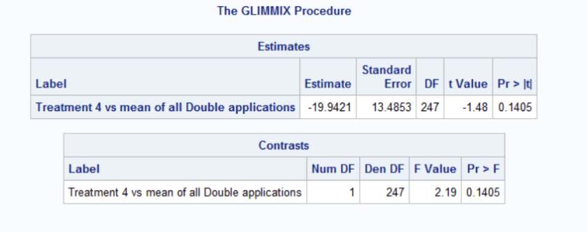
The estimate statement calculates the difference between the mean of Treatment 4 and the mean of all Double applications. The output table provides you with the estimate of that difference, the standard error of that difference along with a t-statistic and an associated p-value. The t-statistic and p-value tell you whether the calculated difference is significantly different than 0.
The contrast statement answers the question: Is there a statistically significant difference between the mean of Treatment 4 and the mean of all Double applications. The output table provides the F-statistic and the associated p-value.
Notice that both output tables provide the same conclusion. The estimate table provides the difference whereas the contrast table does not.
Looking at injury_14d
First and foremost, we are looking at a different variable from the same experimental design. THEREFORE, you should be using the same model. This does not necessarily mean using the exact same code, since we already have a gut feeling or realize that the distribution of our dependent variable, injury_14d will not be the same as yield. So we will need to make appropriate changes.
Let’s start with the same code, check the residuals to see where we are at.
Initial SAS output for Percent Injury at 14 DAA
First thing to note – the program ran with NO errors! So? We should use the output right? We know we have the right model, and all we did was change the dependent variable, so everything should be fine.
STOP!!!!
We need to check our residuals first! So let’s run those and see what happens.
Yup! Definitely a few challenges! But all in all not too bad! We can try to correct for the heterogenous variation of the treatments, but we know we have percentage data and our dataset isn’t THAT big where we’d be comfortable with a normal distribution.
For more information on the Residual Analysis coding and meaning check out the SASsyfridays Blog (Coming soon!)
For more information on the covtest coding and meaning check out the SASsyfridays Blog (Coming soon!)
For more information on back-transforming lognormal data coding check out the SASsyfridays Blog