Getting comfortable with your data in SAS: Descriptive statistics and visualizing your data

We will continue our journey with SAS and data, with a workshop that concentrates on data visualization and descriptive statistics.  Steps that we would undertake as we being working with our research data.

The notes and accompanying SAS code are available here.

The podcast for this workshop is available here.  PLease note that you must have a UGuelph account and you must either be on campus or using the UG VPN to view the podcast.

Name

ARCHIVE: F19 Workshops and Tutorials

Oh yes!  It is that time of year again 🙂  I have to admit that I love fall – my favourite season.  The time for so many new beginnings.  With this all in mind, the new schedule for F19 OACStats workshops is now open for registration at https://oacstats_workshops.youcanbook.me/.   Workshops will be approximately 3 hours long with breaks and hands-on exercises – so bring your laptops with the appropriate software installed.  Please note that the workshops are being held in Crop Science Building Rm 121B (room with NO computers) and will begin at 8:30am.

September 10: Introduction to SAS
September 17: Introduction to R
October 15: Getting comfortable with your data in SAS: Descriptive statistics and visualizing your data
October 29: Getting comfortable with your data in R: Descriptive statistics and visualizing your data
November 5: ANOVA in SAS
November 15: ANOVA in R

I am also trying something new this semester – to stay with the theme of new beginnings 🙂  Tutorials!  These will be held on Friday afternoons from 1:30-3:30 – sorry only time I could get a lab that worked with all the schedules.  They will be held in Crop Science Building Rm 121A (room with computers).  Topics will jump around a bit with time to review and work on Workshop materials.  To register for these please visit:  https://oacstatstutorials.youcanbook.me/

September 13: Saving your code and making your research REPRODUCIBLE
Cancelled:  September 20: Introduction to SPSS
September 27: Follow-up questions to Intro to SAS and Intro to R workshops
October 18: More DATA Step features in SAS
October 25: More on Tidy Data in R
November 1: Open Forum
November 15: Questions re: ANOVAs in SAS and R
November 29: Open Forum

I hope to see many of you this Fall!

One last new item – PODCASTS.  I’ll be trying to record the workshops and tutorials.  These will be posted on the new page and heading PODCASTS.  I will also link to them in each workshops post.

Welcome back and let’s continue to make Stats FUN

Name

Data Visualization: Qualitative Data

Last time we met we took a closer look at bar charts and how we can create bar charts in the different software packages we have access to at the University of Guelph.  This time I’d like to change gears a bit and take a look at qualitative data and some of the options that are available to visualize this type of data.

First, qualitative data is a broad term, and the more I work in the field of data & statistics, the more I learn how people define and use the term “qualitative data”.  So, I am not going to try to define this term for this session, but rather concentrate on how we can use different types of visualization for this broadly defined type of data.

Resources, there are a large number of resources available to you to help you determine what the best option for your visualization is.  I will highlight a couple that I’m currently using.  If you are using others, please let me know and I can add them to the list of resources on this site.

Chart Suggestions – Chart suggestions presented by Andrew Abela from Extreme Presentations.  A decision chart based on the types of data you are using and the story you want to tell or visualize.

Qualitative Chart Chooser 3.0 by Jennifer Lyons and Stephanie Evergreen.  I just came across this wonderful resource.  I really like their approach of “What story are you trying to tell?”  Let’s work through a couple of examples and discuss your thoughts on this resource.

Books:  Data Visualization, A Handbook for Data Driven Design.  Andy Kirk  (2016).

As you peruse these resources, the one thing that you will notice is that you have to be very comfortable with the type of data you are working with.  A quick review:

  • Categorical:
    • Nominal – groups or levels that do you have any relationship between them or any order
      • Examples may include:  gender, religion, Yes/No
    • Ordinal – groups or levels that have an order to them
      • Examples may include: level of education, size, Likert scales
  • Continuous, Scale, Interval, Ratio
    • Data that was collected on a scale, interval, or ratio
      • Examples may include:  age, weight, temperature, weight gain

Bring examples of qualitative data to this session and we will look at possible options to visualize the data, the pros, and the cons.

Name

Data Visualization: Bar Charts

Our first semester, we spent our time discussing and reviewing what Data Visualization is all about, the graphic design aspects of Data Viz, the anatomy of charts and tables.  This semester I’d like to start creating examples of data visualizations.  Since a question that comes up every now and again is:  What is the best way to visualize my results? I’d like to work through common examples and possibly look at how to do these in the different packages we have access to.  I would also like to compile a list of questions that could be answered by our visualization du jour.  My end goal is to have you, the community, provide different examples, walk us through how you created, why you created it, and discuss different options you may not have considered.

Given all of the above, let’s start with a simple Bar chart.  I’ll start with using Excel and see how far we can get using SPSS, SAS, R, and Sigmaplot.

For today’s adventure let us use a small dataset that contains 4 observations of height for 3 treatment groups of plants:

Treatment Group                 Height

GroupQ                                          19
GroupQ                                            4
GroupQ                                          11
GroupQ                                            6

GroupT                                           24
GroupT                                           29
GroupT                                           21
GroupT                                           22

GroupK                                           11
GroupK                                           18
GroupK                                           15
GroupK                                           13

Preparing the Data

It would be wonderful if our programs knew that we want to plot the mean of each group with its standard error, but unfortunately, some programs cannot do this.  Excel is one of these.  We need to provide the means and standard errors for Excel in order for it to create the appropriate bar chart.

Treatment Group    Mean        StdErr
GroupK           14.25           1.49
GroupQ           10.00           3.34
GroupT            24.00           1.78

You will need to enter these values into an Excel spreadsheet or download the file I have already prepared prepared here.

Creating a Bar Chart with Error Bars in Excel

Steps to create bar chart:

  1. Highlight the columns with the treatment group names and means – use your Ctrl key to select cells that are not next to each other
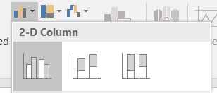
  2. Select the Insert Tab in Excel
  3. Select the 2D bar chart

2D barchart

You should now see a very basic chart with 3 bars, each representing the mean of their respective groups.

Steps to add error bars:

  1. Select the Chart
  2. Click or ensure that the Design tab under the Chart Tools is selected
  3. Click Add Chart Element (top left hand corner of the menu bar)
  4. Select Error bars – More Error Bar options – Format Error Bars dialogue box should show up on your screen – usually at the right hand side of your screen.
  5. Select Custom under the Error Amount section of the Vertical Error bar menu
  6. Select Specify Value.
  7. click on the Positive Error Value data entry button, select the 3 standard error cells in the Excel spreadsheet.
  8. Do the same for the Negative Error Values
  9. Click OK

You should now see Error bars on your 3 bars.  They should also be different sizes, reflecting the different variances for the 3 treatment groups.

This bar chart as it stands is NOT publishable quality, what should you do now?


Excel is a very straightforward way of creating bar charts and a method that many of us are comfortable with.  If you choose to use Excel to create your bar charts, learning how to move between your Statistical package and Excel can save you a lot of time!

Creating a Bar Chart with Error Bars in SPSS

SPSS is a statistical software package commonly used in the social sciences.  It has a great feature called Chart Builder, which we’ll review here.  SPSS can be obtained through CCS and is free for the University of Guelph community.

Importing the Excel file into SPSS

Bringing an Excel file into SPSS is extremely straightforward.

File -> Open -> navigate to the directory/folder where you saved the Excel file -> change the File type from SASS (.sav) to Excel.  Select your file, double check that the SPSS import wizard knows which worksheet you want to import, and click OK.  Tadah!  Excel file now in SPSS.

Steps to create a bar chart in SPSS:

  1. Select graphs from the menu bar
  2. Select Chart builder
  3. In the Gallery tab at the bottom of the dialogue box, select the type of graph you want to create.  In this case, a Bar graph.  Double-click the simple bar chart
  4. A sample bar chart appears in the top part of the window.  You should also see your variables in the Variables box to the left of the graph window.
  5. Drag and drop TRMT to the x-axis
  6. Drag and drop Height to the y-axis
  7. In the Element Properties dialogue box – if it is not open, click on the Element Properties button
  8. We want to ensure that SPSS will calculate the means of each treatment group.  You should see under statistic: Mean is selected for the variable Height.
  9. Click Display Error bars and select Standard Error.
  10. Click Apply and then Click OK to create the bar chart.

As with Excel, you should now see 3 bars matching the 3 treatment groups and their appropriate error bars.  They should also be different sizes, reflecting the different variances for the 3 treatment groups.

This bar chart as it stands is NOT publishable quality, what should you do now?

Creating a Bar Chart with Error Bars in SAS

YES!  You can create publication-quality graphs using SAS!  However, it is or rather it can be challenging.  To review the types of graphs you can create in SAS, please review this link on the SAS Support pages.

Creating a Bar Chart with Error Bars in Sigmaplot


Which program to choose for your graphing requirements?

The answer to this is going to depend on your comfort with the program and time that you have.  Most programs, Excel, SPSS, SAS, and Sigmaplot can all create publication-quality graphs.   You need to ensure that you have all the bits and pieces or that you have a complete anatomy of your chart.

The next Data Visualization session will look at creating Regression Lines in all 4 packages.  Please stay tuned for a change in the time of the next session on Wednesday, February 7, 2018

Data Visualization: The Graph

Before we start on the adventure of creating different visualizations, let’s continue to talk about forms of visualization.  Last time we talked about the Table, now let’s take a similar approach and discuss the Graph or the Chart.

Why use a Graph / Chart?

First let me note that I will more than likely use the words graph and chart interchangeably.

  • When you want to communicate a trend or a pattern in your data
  • Graphs/Charts are more interesting than a table of numbers – let’s be honest here
  • Your reader will tend to remember a graph / chart more readily than a table

Types of Charts

I have been asked on many an occasion, what type of chart should I use to represent my data?  There are so many different types of charts, and which one you choose will always depend on what you are trying to communicate to your reader.  Here is a partial list of the different types of charts:

  • Line chart
  • Bar chart
  • Histogram
  • Scatterplot
  • Pie chart
  • Bubble scatterplot
  • Heat chart
  • Area chart
  • Box and whisker chart
  • Radar chart
  • …..

Anatomy of a Chart

Similar to a table, a chart should be able to stand on its own.  A Title, legend, and footnotes, should provide the reader with enough information that they be able to interpret the graph as it was meant to be.  There are many documents available in textbooks and online to provide you with a guideline on the proper construction of a chart, but I will highlight one.

However, let’s first start with the title:

  • It should be clear and concise
  • Also known as the HEADING – according to the Operations Manual for the Canadian Journal of Plant Science, Canadian Journal of Soil Science, and the Canadian Journal of Animal Science.
  • Capitalize the heading in sentence format with no period at the end
  • Do not indent the second and any subsequent lines
  • No units of measure in the title

From the Designing Science book http://dx.doi.org/10.1016/B978-0-12-385969-3.00008-8   you can find a wonderful diagram on the Anatomy of the Chart in Figure 1.  Highlighting the structure of a chart which may include the following items:

  • y-axis
  • y-axis label
  • x-axis
  • x-axis label
  • key to symbols used in the chart
  • Statistical symbols
  • Major ticks
  • Minor ticks
  • Error bars
  • Symbols on the chart

Depending on the type of chart you will be creating all or some of the above features will be extremely important.

Best Practices for creating a Chart

  • 2D chart is always better and easier to understand than a 3D chart
  • Background colour – keep it simple – white works great or the colour of your presentation
  • Axes colour – Use the highest contrast colour – black?
  • Data colour – keep group colours consistent – distinct from each other
  • Gridlines – only if you need them – they can be very distracting
  • Font – use sans serif type fonts.  Helvetica is recommended
  • Significance – use *, **, *** – consistent
  • Error/variability – do not clutter your chart
  • Ticks on your scales – use a natural count

Selecting a Graph or a Table?

When should you use which one?

  • Remember a table is appealing to the “reader”
  • If you need your audience to remember a number or if you need to highlight a number/value – a table may be best
  • Graphs / charts – may have that impact that tables do not.
  • Each has their place and purpose

Examples of Charts

While reviewing these examples of different types of charts published in journals and on the web – think about the best practices listed above.  Do all of these examples follow them?  Are they easily read?  Do they stand alone?

When you embark on creating your own table and/or chart, think about these guidelines and best practices.

Name