Crimes of Statistics: Longitudinal Studies or Repeated Measures – What are the implications?

What is a longitudinal or repeated measures study?

Let’s take a little step back first and recall the conversation we had back in the Fall semester  – experimental unit – the unit to which the treatment is applied to.  This is a VERY crucial concept and definition when we talk about a repeated measures study.

Like the term says repeated measures, the researcher is taking the same measurements on “some unit” repeatedly.  We often think of this in terms of time.  I’m going to take weight measures or height measures every month during the summer growing period.  The question that needs to be answered is “What” unit?  Is it the same experimental unit?  If yes, then we have a classic repeated measures study.  If no, then we have reps.

Longitudinal study is a term often used in the social sciences.  We tend to think of a longitudinal study – again in terms of time – and usually in the context of a longitudinal survey.  The experimental units, in this case, are the survey respondents, and they will be answering the same survey several times in a year or across many years.

Bottonline, a longitudinal or repeated measures study is a study where the experimental unit is measured more than once.

Examples of longitudinal or repeated measures study

  • An educational survey where students answer the survey after high school, after their 1st year of University, 2nd year, 3rd year, and after graduating
  • A dairy lactation study, where the same cows in a herd are milked and measured each day during their first 3 lactations.
  • A new diet trial, where feed consumed by dogs is measured every day for a 21 day trial
  • A new herbicide trial, where plots in a field are measured every week for weed counts
  • A soil texture trial, where texture is measured at 4 depths of a soil core.

Challenges with a longitudinal or repeated measures study

The goal of many studies is to examine or determine whether differences exist between treatments of interest in the study.  We gather our data and conduct the statistical analysis to look at the variation between our treatments in that study.  When we enter our data, chances are we will enter an observation every time we take a measurement.  For example, if we have 20 dogs on our trial and we are measuring their feed intake for 21 days, we will have 420 lines of data.  OR we may have a dataset that has 20 lines, with each line containing 21 measures for each dog.  Either way, we have 21 measurements for each experimental unit.  The big challenge of a repeated measures analysis is to recognize that the variation within the experimental unit, dog in this example, needs to be accounted for, before looking at the differences between the treatments, diets in this case.

If I use my data cloud visual to try and explain.  We have 420 measures in our experiment – let’s throw this data up and think of it as a big cloud of data.  With our analysis, the goal is to partition that cloud into the treatment groups and hopefully be able to see distinct treatment groups.  However, we have 21 measurements for each dog and we want to ensure that when we start to look at treatments effects, that we keep those 21 measures for the dog together as a unit.  Remember we only have 20 experimental units and that’s where we should be concentrating when we look for treatment effects.  We do NOT have 420 experimental units!

No matter what statistical software package you use, there will be options to identify your experimental unit!  You need to find it.

Can you think of trials or studies that you have done in the past or will be doing in the future, is it a longitudinal or repeated measures study?

Questions to ask to help you determine if you have a longitudinal or repeated measures study:

  1. What is your experimental unit?
  2. Is your experimental unit being measured more than once?

Name

SPSS: Descriptive Statistics and Charts

Last week in the RPD6380 class, we talked about how to enter data into an Excel spreadsheet, and then opening it into the SPSS software.

As a recap:

  • Create variable names at the top of each column in Excel to match your variables/questions.  Use the Best Practices to naming your variables:
    • Keep it short (Maximum 32 characters in SPSS)
    • Start with a letter – can contain numbers
    • NO funny characters – %,$,#, etc…
    • NO blank spaces – use an _ if you want
  • Save your file in Excel
  • To open in SPSS
    • File
    • Open Data
    • Navigate to where you saved your file
    • Change File Type to Excel
    • Select your file and click Open
    • Answer the questions in the dialogue box
  • Make sure you save your data in SPSS

Variable Labels

In the Variable View of SPSS, take the time to fill in the Labels for each variable.  This way you won’t have to remember what those shortened variable names are in a couple of months or years.

Value Labels

We worked through an exercise where we coded some of our data.  Males/Females were m/f or 1/2.  Be sure to add all these labels in the Values section of the Variable View in SPSS. The time you spend doing this at the start of your research will save you a LOT of time when you do your analysis.

Missing Values

Be sure to add any missing codes to the Missing column in the Variable View

Descriptive Statistics

At the beginning of any statistical analysis, learning more about your data is a great place to start.  Descriptive statistics are essentially that – they describe your data, or they summarize your data to give you a good, solid base understanding of what you have collected.  The type of descriptive statistics you will conduct will depend on the type of variable you have.  Remember the 3 types of variables that SPSS distinguishes between?

  • Scale – a continuous piece of information, also referred to as Interval or Ratio.  Examples: age, weight, height
  • Nominal – a categorical piece of data – there is NO relationship between the categories.  Examples:  religion, colour, gender
  • Ordinal – a categorical piece of data – this time there is a relationship or order to the categories.  Examples:  Year of study, age group, likert scales

Each of these data types will use a different type of descriptive statistic.  For instance, calculating the mean of colour makes no sense at all, but a frequency count of colour does work.

Frequency

To calculate the frequency of a categorical variable (nominal OR ordinal) in SPSS:

  • Analyze
  • Descriptive Statistics
  • Frequencies
    • Select the variables in question and drag to the right hand side
      • As an example, select Income Category
    • Click OK to run

You should now have a frequency table of the variable, Income Category

The lists the categories of the variable, in this case: Below $25; $25-$49; $50-$74; $75+.  If you had not provided the value labels, you would see 1; 2; 3; 4 as the categories with no explanation as to what they represent.

The table lists Frequency – actual count of observation in each category; Percent – percent of observations as a total; Valid Percent – this will change if you have missing observations.  The Valid Percent is the percentage of observations that have values for Income Category; Cumulative Percent.

Try:

  • Run the Frequency procedure on the variable called Internet
  • Can you describe what you see?

Mode

Mode is the value in the data that appears the most.  So let’s switch variables and run a frequency on the variable Job Satisfaction.  When you run the frequency you have a table that shows you how many people answered each of the 5 levels of this Likert Scale:

  • Highly dissatisfied = 1109
  • Somewhat dissatisfied = 1268
  • Neutral = 1393
  • Somewhat satisfied = 1406
  • Highly satisfied =1224

By looking at these results I can see that Somewhat satisfied appears to be the category that people selected the most.  But let’s get SPSS to do the hard work for us and confirm whether this is correct or not.

To obtain the MODE of a variable:

  • Analyze
  • Descriptive Statistics
  • Frequencies
    • Select the variables in question and drag to the right hand side
      • As an example, select Job Satisfaction
    • Click on the Statistics button on the right
      • Select Mode
      • Click Continue
      • Click OK

You should now see the Mode in the first table of the Frequency output.

Try:

  1. What is the mode?
  2. Would you calculate the MODE on a variable such as income?  Why or Why not?

Median

The median of a variable, is the middle value.  So if you have an even number of categories, there will be no median or middle value, but if you have an odd number you will see it.

To obtain the MEDIAN in SPSS, follow the same instructions as the MODE, but select the MEDIAN in the Statistics dialogue box.

Try:

  1. What is the median for Job Satisfaction?
  2. What is the median value for Level of Education?

Mean

The mean or average is calculated on a scale variable or continuous variable.  It just doesn’t make sense to calculate the mean of a categorical variable.

To obtain the MEAN in SPSS:

  • Analyze
  • Descriptive Statistics
  • Descriptives
    • Select the variable in question and drag to the right hand side
      • use income as an example
      • Click OK to run

You should now have a table with N, Minimum, Maximum, Mean, and Standard Deviation for the household income variable.  These are the default values you obtain when you run this analysis.  But, what happens if you want the Sum or the Standard Error of this variable?

  • Analyze
  • Descriptive Statistics
  • Descriptives
    • Select the variable in question and drag to the right hand side
    • Select the Options button – this will open another dialogue box that has a list of statistics to select from
      • Select Sum and S.E. mean (standard error of the mean)
    • Click Continue
    • Click OK to run

Your output table will now contain these added statistics.

Try:

  1. Select another Scale variable from your dataset and calculate the mean, variance, and standard deviation.

Explore Function in SPSS

Sometimes you may want to determine what the mean household income by marital status or by another categorical variable.  Till now, we’ve been looking at the entire dataset.  There are a few ways to do this, but the most direct way is to use the Explore function in SPSS.

  • Analyze
  • Descriptive Statistics
  • Explore
    • In the Dependent List box, add the variables for which you would like to calculate the means – for example:  household income
    • In the Factor List box, add the variable by which you would like to see the means for – for example: marital status
    • Click Ok to run.

You will now see a much larger table than we have seen to date.  SPSS provides you with a long list of descriptive statistics for household income by each level of marital status.

You will also see a Stem and Leaf plot along with a Boxplot to provide you with a sense of the distribution of the data.  More information to help you get a better feeling for the data that you are working with.

Summary

The common descriptive statistics that are used include: frequency, median, mode, mean, and measures of variation (standard deviation, standard error, etc..).  Each of these statistics should be run on the appropriate types of data – keep in mind, that a frequency on a variable such as age will give you a long table with meaningless information.

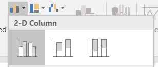
Chart Builder in SPSS

Numbers and statistics can be fun, but sometimes putting these numbers into context with a chart or graph may reach a broader audience of understanding.  What do I mean by that?  How many of you will remember a number vs how many of you will remember a graph that shows a trend?

Building charts in SPSS is quite straightforward and fun!  You’ll see!!

Let’s start by creating a barchart for our job satisfaction variable.  We want to see a bar for each level and we want to see the count.

In SPSS:

  • Graphs
  • Chart Builder – this will open a dialogue box
    • Notice on bottom half – a gallery of all the different types of charts you can create in SPSS.
    • We want a simple barchart
      • Select bar
      • Then double-click on the first barchart listed
      • Once you do this you should see the skeleton of a bar chart appear in the top half of your dialogue box.
      • All you need to do now, is to drag and drop the variables where they are appropriate.
      • For this example:
        • Select Job satifisfaction and drag it to the x-axis
        • On the right, you may see an Element Properties dialogue box (if you do not see this – Click on the Element Properties button to open it).
        • Note that under Statistics, Count is selected – this is what we want.  But click on this to see what other statistics are available.
      • To create the graph Click OK

You should now see a very plain barchart that matches the Frequency counts we created earlier.

Let’s create a chart that shows the average income for each level of job satisfaction.  I’m curious to see whether the folks that are not satisfied with their job have a lower average income.

So, let’s start this again:

  • Graphs
  • Chart Builder – this will open a dialogue box
    • Select Barchart again
    • Drag and drop Job Satisfaction to the x-axis
    • Now drag and drop Household income to the y-axis
    • Notice how the Statistic changed to Mean.  This is what we want.
    • Let’s run in by clicking OK

Hmm…  now that’s an interesting graph!

One last piece missing from this graph – error bars!  Whenever you have charts with means, you should ALWAYS provide some measure of variance.  So let’s add some error bars and we’ll try standard error.

  • Graphs
  • Chart Builder – this will open a dialogue box
    • Select Barchart again
    • Drag and drop Job Satisfaction to the x-axis
    • Now drag and drop Household income to the y-axis
    • Ensure that the statistic is mean
    • Under the statistics box in the Element Properties box, check the Display Error Bars box
      • Now you have a few options, as stated above let’s use the Standard Error option – select Standard Error
      • Click Apply
    • Click OK to run chart

Providing the error bars gives the reader a “fuller” picture of the data.  Although in this case it does not change the story!

Try:

  1. Create a barchart that shows the mean household income by job satisfaction for the 2 levels of marital status.  Be sure to include error bars.
  2. What question does this barchart answer?

More charts

I used the example of a barchart, but the more you use the ChartBuilder, you can see how straightforward it is to create charts in SPSS.  Try playing around with a different chart and see what happens.

Summary

  • Barchart for counts
  • Barchart to show means of groups
  • Side-by-side barchart to show means of group


Name


ARCHIVE: W18 RDM Workshop: Store and Analyze

This workshop is the second in a series of 4 offered in partnership with Carol Perry, Associate Librarian Research and Scholarship.  These workshops are hands-on and have exercises associated with each aspect being covered in the workshop.

This workshop explores the areas of data storage and data analysis in the context of Research Data Management.  The powerpoint presentation is available here, please review for more information and contact either Carol Perry or Michelle Edwards for questions.

Name

Data Visualization: Bar Charts

Our first semester, we spent our time discussing and reviewing what Data Visualization is all about, the graphic design aspects of Data Viz, the anatomy of charts and tables.  This semester I’d like to start creating examples of data visualizations.  Since a question that comes up every now and again is:  What is the best way to visualize my results? I’d like to work through common examples and possibly look at how to do these in the different packages we have access to.  I would also like to compile a list of questions that could be answered by our visualization du jour.  My end goal is to have you, the community, provide different examples, walk us through how you created, why you created it, and discuss different options you may not have considered.

Given all of the above, let’s start with a simple Bar chart.  I’ll start with using Excel and see how far we can get using SPSS, SAS, R, and Sigmaplot.

For today’s adventure let us use a small dataset that contains 4 observations of height for 3 treatment groups of plants:

Treatment Group                 Height

GroupQ                                          19
GroupQ                                            4
GroupQ                                          11
GroupQ                                            6

GroupT                                           24
GroupT                                           29
GroupT                                           21
GroupT                                           22

GroupK                                           11
GroupK                                           18
GroupK                                           15
GroupK                                           13

Preparing the Data

It would be wonderful if our programs knew that we want to plot the mean of each group with its standard error, but unfortunately, some programs cannot do this.  Excel is one of these.  We need to provide the means and standard errors for Excel in order for it to create the appropriate bar chart.

Treatment Group    Mean        StdErr
GroupK           14.25           1.49
GroupQ           10.00           3.34
GroupT            24.00           1.78

You will need to enter these values into an Excel spreadsheet or download the file I have already prepared prepared here.

Creating a Bar Chart with Error Bars in Excel

Steps to create bar chart:

  1. Highlight the columns with the treatment group names and means – use your Ctrl key to select cells that are not next to each other
  2. Select the Insert Tab in Excel
  3. Select the 2D bar chart

2D barchart

You should now see a very basic chart with 3 bars, each representing the mean of their respective groups.

Steps to add error bars:

  1. Select the Chart
  2. Click or ensure that the Design tab under the Chart Tools is selected
  3. Click Add Chart Element (top left hand corner of the menu bar)
  4. Select Error bars – More Error Bar options – Format Error Bars dialogue box should show up on your screen – usually at the right hand side of your screen.
  5. Select Custom under the Error Amount section of the Vertical Error bar menu
  6. Select Specify Value.
  7. click on the Positive Error Value data entry button, select the 3 standard error cells in the Excel spreadsheet.
  8. Do the same for the Negative Error Values
  9. Click OK

You should now see Error bars on your 3 bars.  They should also be different sizes, reflecting the different variances for the 3 treatment groups.

This bar chart as it stands is NOT publishable quality, what should you do now?


Excel is a very straightforward way of creating bar charts and a method that many of us are comfortable with.  If you choose to use Excel to create your bar charts, learning how to move between your Statistical package and Excel can save you a lot of time!

Creating a Bar Chart with Error Bars in SPSS

SPSS is a statistical software package commonly used in the social sciences.  It has a great feature called Chart Builder, which we’ll review here.  SPSS can be obtained through CCS and is free for the University of Guelph community.

Importing the Excel file into SPSS

Bringing an Excel file into SPSS is extremely straightforward.

File -> Open -> navigate to the directory/folder where you saved the Excel file -> change the File type from SASS (.sav) to Excel.  Select your file, double check that the SPSS import wizard knows which worksheet you want to import, and click OK.  Tadah!  Excel file now in SPSS.

Steps to create a bar chart in SPSS:

  1. Select graphs from the menu bar
  2. Select Chart builder
  3. In the Gallery tab at the bottom of the dialogue box, select the type of graph you want to create.  In this case, a Bar graph.  Double-click the simple bar chart
  4. A sample bar chart appears in the top part of the window.  You should also see your variables in the Variables box to the left of the graph window.
  5. Drag and drop TRMT to the x-axis
  6. Drag and drop Height to the y-axis
  7. In the Element Properties dialogue box – if it is not open, click on the Element Properties button
  8. We want to ensure that SPSS will calculate the means of each treatment group.  You should see under statistic: Mean is selected for the variable Height.
  9. Click Display Error bars and select Standard Error.
  10. Click Apply and then Click OK to create the bar chart.

As with Excel, you should now see 3 bars matching the 3 treatment groups and their appropriate error bars.  They should also be different sizes, reflecting the different variances for the 3 treatment groups.

This bar chart as it stands is NOT publishable quality, what should you do now?

Creating a Bar Chart with Error Bars in SAS

YES!  You can create publication-quality graphs using SAS!  However, it is or rather it can be challenging.  To review the types of graphs you can create in SAS, please review this link on the SAS Support pages.

Creating a Bar Chart with Error Bars in Sigmaplot


Which program to choose for your graphing requirements?

The answer to this is going to depend on your comfort with the program and time that you have.  Most programs, Excel, SPSS, SAS, and Sigmaplot can all create publication-quality graphs.   You need to ensure that you have all the bits and pieces or that you have a complete anatomy of your chart.

The next Data Visualization session will look at creating Regression Lines in all 4 packages.  Please stay tuned for a change in the time of the next session on Wednesday, February 7, 2018

ARCHIVE: W18 RDM Workshop: Organize and Document

This workshop is the first in a series of 4 offered in partnership with Carol Perry, Associate Librarian Research and Scholarship.  These workshops are hands-on and have exercises associated with each aspect being covered in the workshop.

This workshop explores the areas of data organization and documentation in the context of Research Data Management. The powerpoint presentation is available here, please review for more information and contact either Carol Perry or Michelle Edwards for questions.

Name